Redesign In 20 Minutes (22) – Betfair’s Header
Sep 1, 2010

This week I’m redesigning Betfair’s header, in the not logged in state, which I think is a cluttered with a few too many options and different design elements.
The header should give all different players (target groups) options to find what they want to do next. It could for instance be:
Register
Log in
Get help
Contact Betfair
Get to know more about Betfair
Today

Image 1. Betfair’s current page header (Want it larger? Click on the image)
The header today have many different design elements in different places: a top menu, the logo, the login box and the menu.
I don’t believe that it is necessary to show everything to the player at all times. Instead it should be based on the different states a player can be in. Just show information/links when it is relevant.
And put focus on the things you want your (potential) players to do.
Redesign suggestion
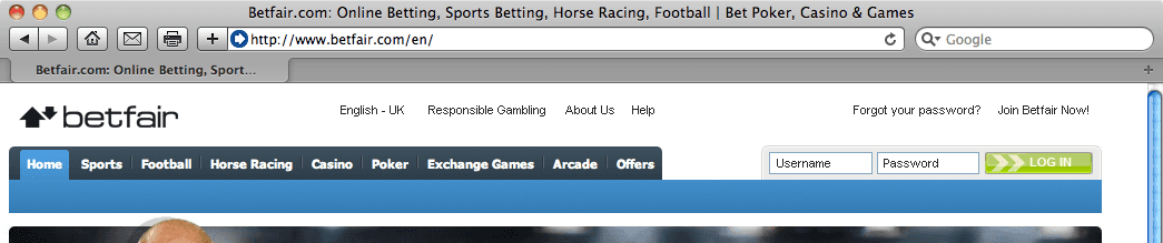
Image 2. My redesign suggestion (Want it larger? Click on the image)
I’ve done a few things in my quick redesign:
Changed the top menu from being: About Us, Help, Responsible Gaming, Site selection and Start page selection. To being: Site selection, Responsible Gaming, About Us and Help.
Removed ”Start page selection” which could be a nice to have functionality but should be placed under the player’s settings instead.
Removed the top menu background color which makes the top cleaner.
Removed the ”Login for the latest prices”.
Redesigned the login box to have a more prominent login button and moved the ”Forgotten password” and ”Join Betfair Now!” links
Removed the ”Forum” option from the main menu. I would move this to a menu alternative below each of the main options instead.
I believe my suggestion makes the header a lot cleaner which in the end will help the player reach their goal faster!
What do you think?
/Staffan